Hi everyone,
I've been talking about it for a while now, but it's finally here: my first 'drop', which I hope means 'releasing a lot of comics at once' becasue that's how I've been using the word. These have all been printed by me, at home, and it's been *something* let me tell you.To try and simplify postage, I've bundled them all together to start with - if I don't sell the bundles as they are I'll split them later on. But this way I can tuck them all in an envelope and charge £2 P&P in the UK. Eventually I'll put 'Curse' and 'House' up on Gumroad, and they'll probably end up in Explosive Sweet Freezer Razors, too.
The comics being sold are: TUESDAY'S SALTED CURSE; FOLD MOUNTAIN; NOT THIS HOUSE
You can buy them here: https://buysmallpress.com/product/tuesdays-folded-house/
Here comes some more information about them all which you may find interesting, or you may not, it's totally up to you. If you want to just go and buy the comics and avoid all this, please be my guest.

Tuesday's Salted Curse: During the month-long Hackney Comic & Zine Fair I decided I'd make a brand new comic and use Twitter to track the process. I started by taking a random selection of paper from the Discarded Paper Box in my office, and then started working into it - a lot of the pages were from where I tried to print out Moon Puke but instead of printing the images it printed the code that described the print job. Once that was all done and scanned I printed out a second copy and worked back over the top of that, using watercolour for the most part. That was enough, really - after the second iteration there wasn't really anywhere for me to take it.
Then it was the writing part. The art reminded me of a fantasy landscape, and I wanted to do something similar to Mars Volta's Desloused In The Comatorium, telling a story about a very abstract but mapped-out place. From that point I meandered a fair amount - at first the narrative was just a description of people and places in this place, then I tried really hard to create plot and characters using two characters from a previously unrealised figurative comic, but that got tired too. I was flailing around a bit, until the Petrol Crisis happened. Remember that? Loads of people were told by the press that they shouldn't hoard petrol, so they immediately ran out to hoard as much as they possibly could - as far as I can tell, it was particularly prevalent in the South of England, around my neck of the woods. And I was angry and disappointed by the whole thing that I wrote a fantasy about witches ending the world. It's nasty - the witches are not nice people, and they don't do nice things. It's also very cathartic.
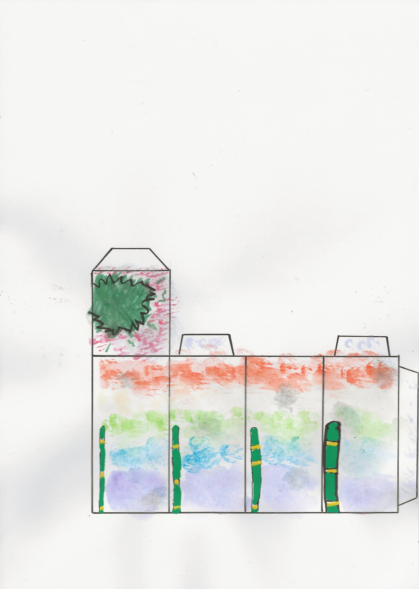
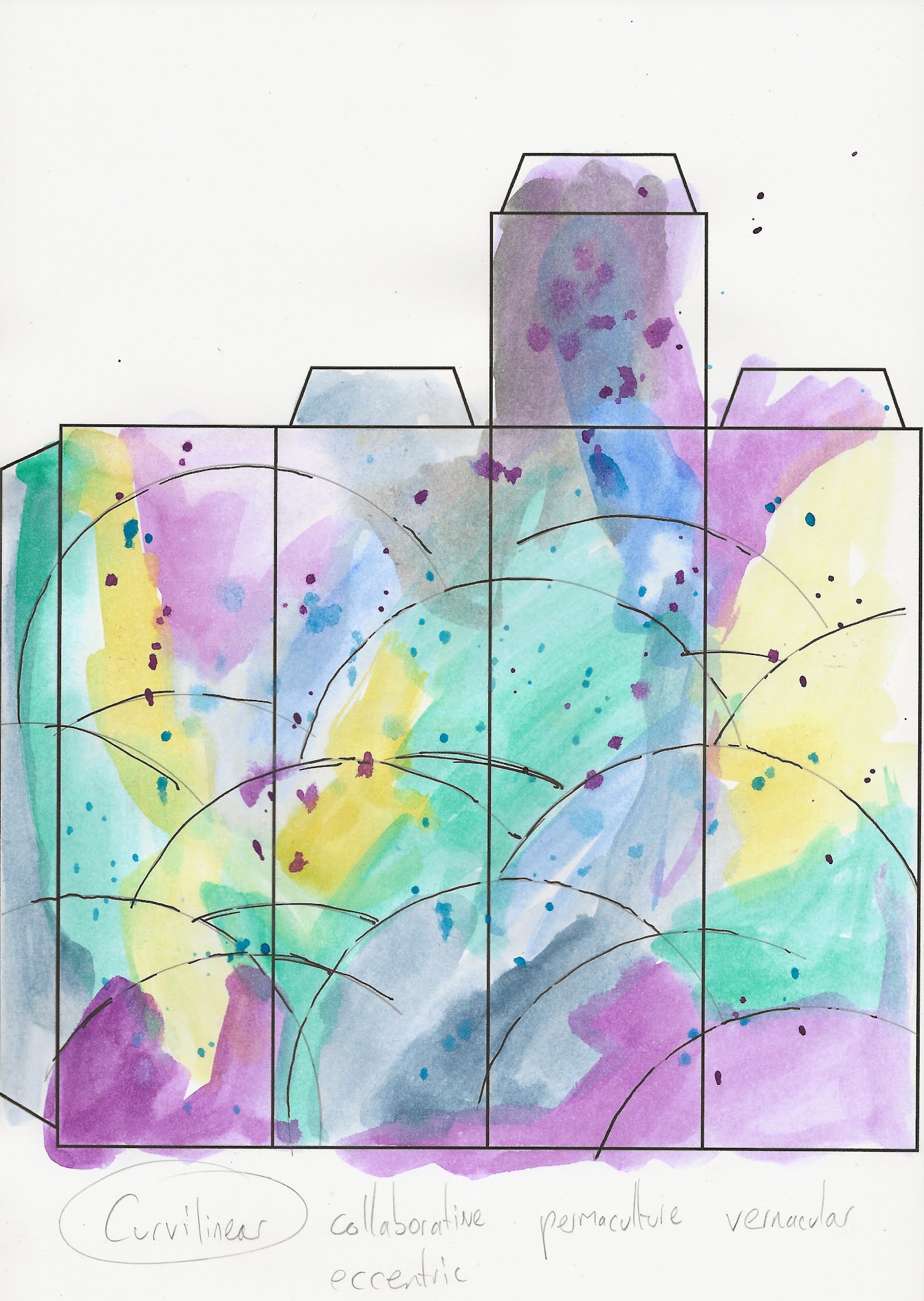
Fold Mountain: Not too long ago I did an art show where I invited people to send me their versions of Utopia on little templates that could be turned into buildings and racked up to create a 'City Of Utopias' - here's a photo of it:
Then it was the writing part. The art reminded me of a fantasy landscape, and I wanted to do something similar to Mars Volta's Desloused In The Comatorium, telling a story about a very abstract but mapped-out place. From that point I meandered a fair amount - at first the narrative was just a description of people and places in this place, then I tried really hard to create plot and characters using two characters from a previously unrealised figurative comic, but that got tired too. I was flailing around a bit, until the Petrol Crisis happened. Remember that? Loads of people were told by the press that they shouldn't hoard petrol, so they immediately ran out to hoard as much as they possibly could - as far as I can tell, it was particularly prevalent in the South of England, around my neck of the woods. And I was angry and disappointed by the whole thing that I wrote a fantasy about witches ending the world. It's nasty - the witches are not nice people, and they don't do nice things. It's also very cathartic.
Fold Mountain: Not too long ago I did an art show where I invited people to send me their versions of Utopia on little templates that could be turned into buildings and racked up to create a 'City Of Utopias' - here's a photo of it:

To make it multi-level I made some weird paper structures, full of half-thought-through structural elements, stuck together with Pritt-Stick and tape. When the show closed and I brought all this stuff home I couldn't bring myself to throw away all this paper, and so on a whim I fed it through my paper strimmer and created a whole bunch of paper strips. And then with nothing else to think of, I cut those strips in half and folded them in half and voila I had 30-odd little covers for comics. Then I had to think of something to fill them up with.
A few hours of folding paper later (inspired by Colossive Press' innovations) I had this idea of interlocking mountain ranges which could be folded in and out of each other. I managed to work out a way to fit 8 basic mountain ranges onto two sheets of paper and after a bit of cutting and folding fit neatly inside the covers I'd made. I whacked some paint on the covers, stuck some staples in the whole thing and wham: lots of unique little foldable mountain ranges. I mean, that sounds easy - between me making mistakes and my printer being a fuckface it was a ballache to put together.
A few hours of folding paper later (inspired by Colossive Press' innovations) I had this idea of interlocking mountain ranges which could be folded in and out of each other. I managed to work out a way to fit 8 basic mountain ranges onto two sheets of paper and after a bit of cutting and folding fit neatly inside the covers I'd made. I whacked some paint on the covers, stuck some staples in the whole thing and wham: lots of unique little foldable mountain ranges. I mean, that sounds easy - between me making mistakes and my printer being a fuckface it was a ballache to put together.

Not This House: After I'd printed Tuesday's Salted Curse, I'd used up a lot of colour print cartridges but very few black ones, and so thought I'd make a black and white comic to even it all out. I actually had the artwork already - it's a very long story, but if you've read Thunders you might notice that the page layouts are the same, although the pages are in different orders.

I then decided to write, but didn't know what. But I'd recently done a visualisation excercise to help get rid of some psychological baggage that was very weird, so that went in. And then I thought about the nature of ghosts, and imagine that I was a kind of ghost now that I work from home, and I just sort of float about the house not doing much, and that got twisted further, and then I got fed up with myself and wrote a third act. Not This House is the most structured thing I've read in a long time - it's got three definite 'acts' of 4 pages each, which is interesting if that sort of thing interests you.
The cover went through a lot of iterations - at one point I thought it would be nice to have a mostly white cover becasue it would save on ink, but I couldn't make it look nice and then spent a couple of days layering different types of paint onto a piece of cardboard, which after a bit of tweaking became the actual cover. It looks much better here than it does in real life, trust me.
AAAAnd that's all I have the energy and attention span to talk about for the moment.
In other news:
Once I've sold all of these and posted them, I'll be getting Ghosts In Things ready to print! Finally!
I'm also working on a four page short for the Observer Comic Prize thing which probably won't win but I'm trying very hard to make something the judges will at least nod and shrug in confused admiration at. It's currently about a fishing village going to church, but their church is a cave and everyone's a baddie.
I did a five page comic for a Brazilian anthology called Autofagia which I think is coming out soon - it's all in Brazilian and my tired brain can't make any sense of what's happening.
A while ago I did two one-page comics for Tales From The Quarantine which I think is finally about to be posted.
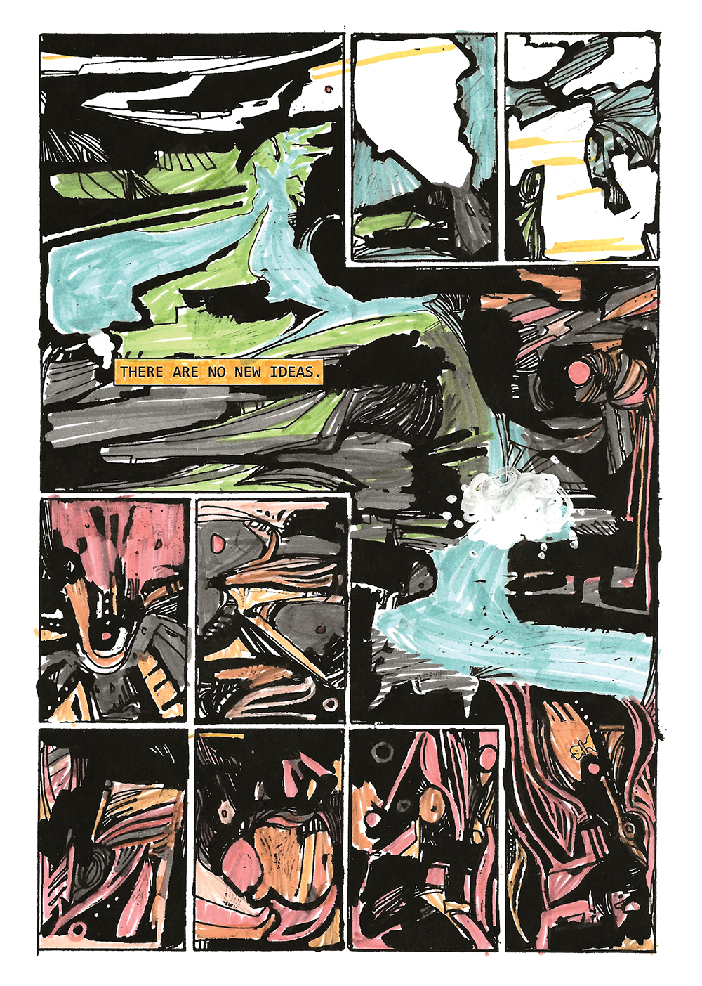
OH and best of all: I was asked by German comics scholarship magazine Closure to do a five page comic for their non-narrative issue but ended up making a 12 page comic and a 10-page photo-comic about making comics. I've put my favourite page from that process comic here, it looks like nonsense but in context it's a very strong metaphor for how I work:

The cover went through a lot of iterations - at one point I thought it would be nice to have a mostly white cover becasue it would save on ink, but I couldn't make it look nice and then spent a couple of days layering different types of paint onto a piece of cardboard, which after a bit of tweaking became the actual cover. It looks much better here than it does in real life, trust me.
AAAAnd that's all I have the energy and attention span to talk about for the moment.
In other news:
Once I've sold all of these and posted them, I'll be getting Ghosts In Things ready to print! Finally!
I'm also working on a four page short for the Observer Comic Prize thing which probably won't win but I'm trying very hard to make something the judges will at least nod and shrug in confused admiration at. It's currently about a fishing village going to church, but their church is a cave and everyone's a baddie.
I did a five page comic for a Brazilian anthology called Autofagia which I think is coming out soon - it's all in Brazilian and my tired brain can't make any sense of what's happening.
A while ago I did two one-page comics for Tales From The Quarantine which I think is finally about to be posted.
OH and best of all: I was asked by German comics scholarship magazine Closure to do a five page comic for their non-narrative issue but ended up making a 12 page comic and a 10-page photo-comic about making comics. I've put my favourite page from that process comic here, it looks like nonsense but in context it's a very strong metaphor for how I work:
If you've made it this far: well done, I'm proud of you. If you buy my comics I hope you like them.


